Urbancare / Brand identity
Urbancare.A welcoming symbol.
A U, a roof, and a visual language bringing geometry, colour and material together.

Managing properties.
Communicating trust.
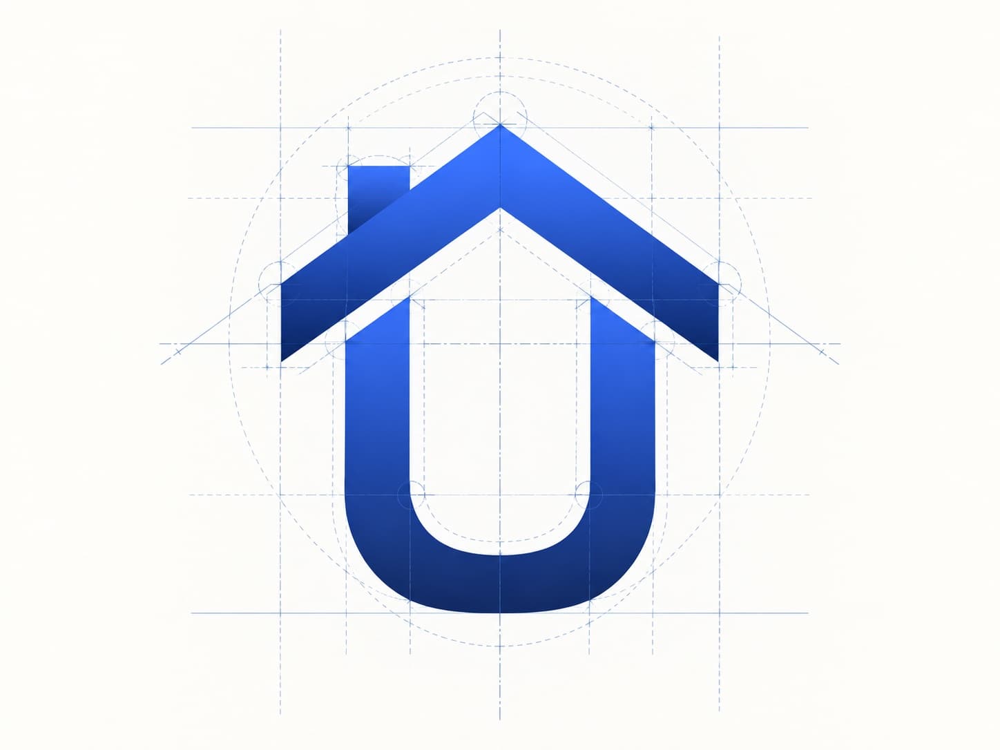
Urbancare provides condominium management services. Its work connects people, buildings and day-to-day management: the visual identity brings this world into a simple symbol, with the home at its centre.
For this project, we worked on the logo and its applications: the symbol combines a U and a roof, while blue and the versions on light and dark backgrounds create a consistent presence.
Logo design
A geometric symbol and a wordmark sharing a single composition.
Visual identity
A blue colour direction, with contrasts and variants for different formats.
Brand applications
Business cards, folder and sign: the system takes shape across materials.
Two shapes.
One idea.
The initial becomes architecture: a roof completes the U, turning a letter into a symbol. Geometric construction connects curves, diagonals and negative space.
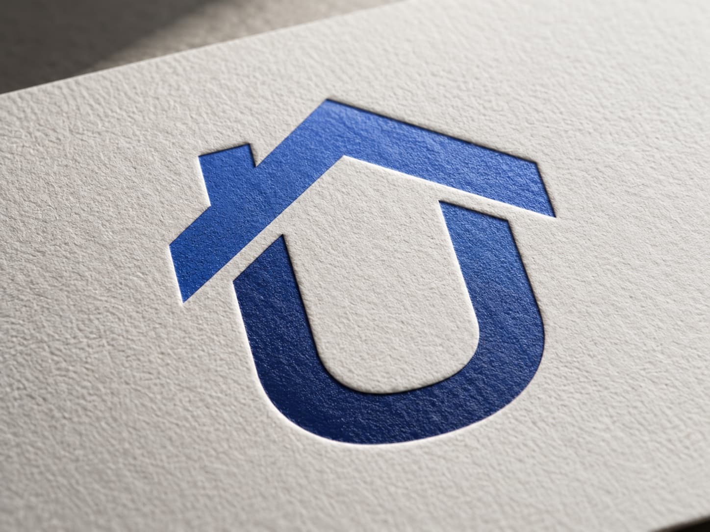
01 / Geometry behind the symbol
03 / Colour direction
Deep.
Essential.
Blue runs through the identity. Brighter in the symbol and deeper in its applications, it meets white and the natural tones of the materials.
From the symbol.
To objects.
The system remains recognisable across formats. The full logo and symbol share the business cards, while blue brings continuity to the folder and sign.
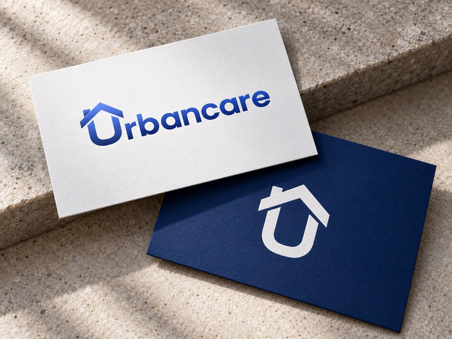
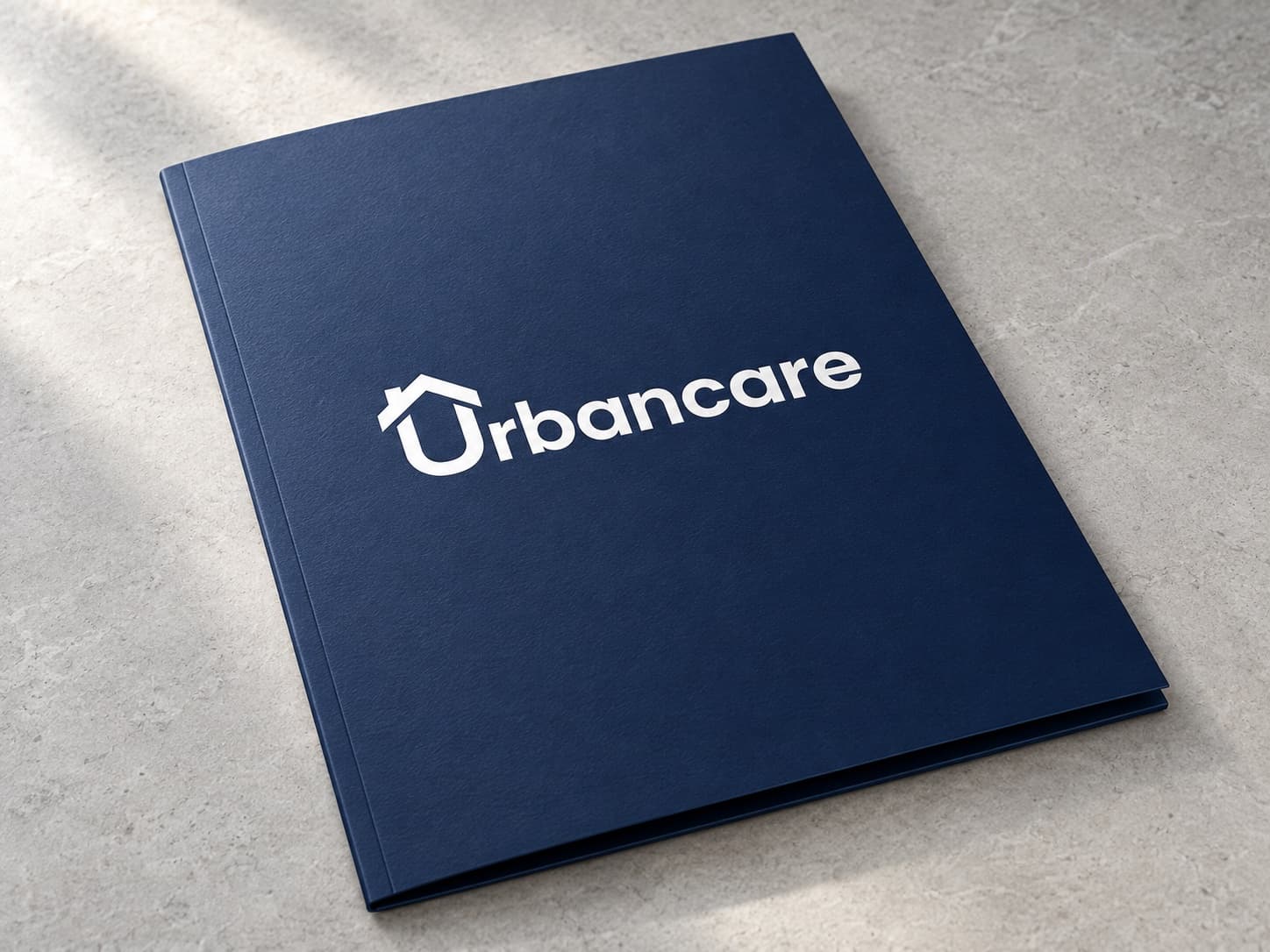
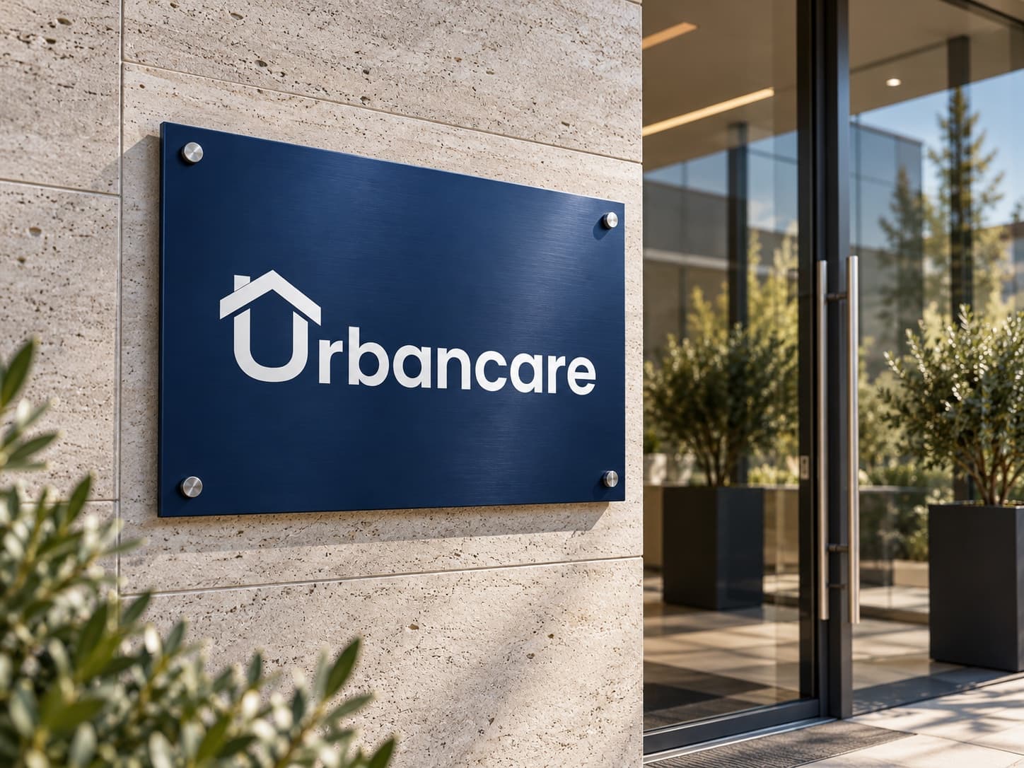
Visualisations of the identity applications.
Your next identity