Vinci e Soltur / Brand identity
Vinci e Soltur.Care takes shape.
Water and leaf. Two colours, one symbol expressing care for the spaces around us.


Taking care.
Being recognised.
Vinci e Soltur works in cleaning and sanitisation services. Practical work involving spaces, people and a daily presence. The identity turns that attention into a direct visual language, recognisable even before reading the name.
The visual identity centres on a droplet: blue recalls water, while green introduces a leaf shape. Curves flow through the symbol and become a graphic element that can extend to larger formats.
Symbol and wordmark
A droplet built from flowing shapes, accompanied by an outlined wordmark.
Blue and green
Two colour families giving the symbol character and its applications continuity.
An identity at work
Business cards, clothing and a vehicle: the visual language meets the business’s touchpoints.
Water.
Leaf. Movement.
The outer silhouette holds the symbol together. Inside, white spaces separate its two components and create a winding path: a compact mark with a movement recognisable from a distance.
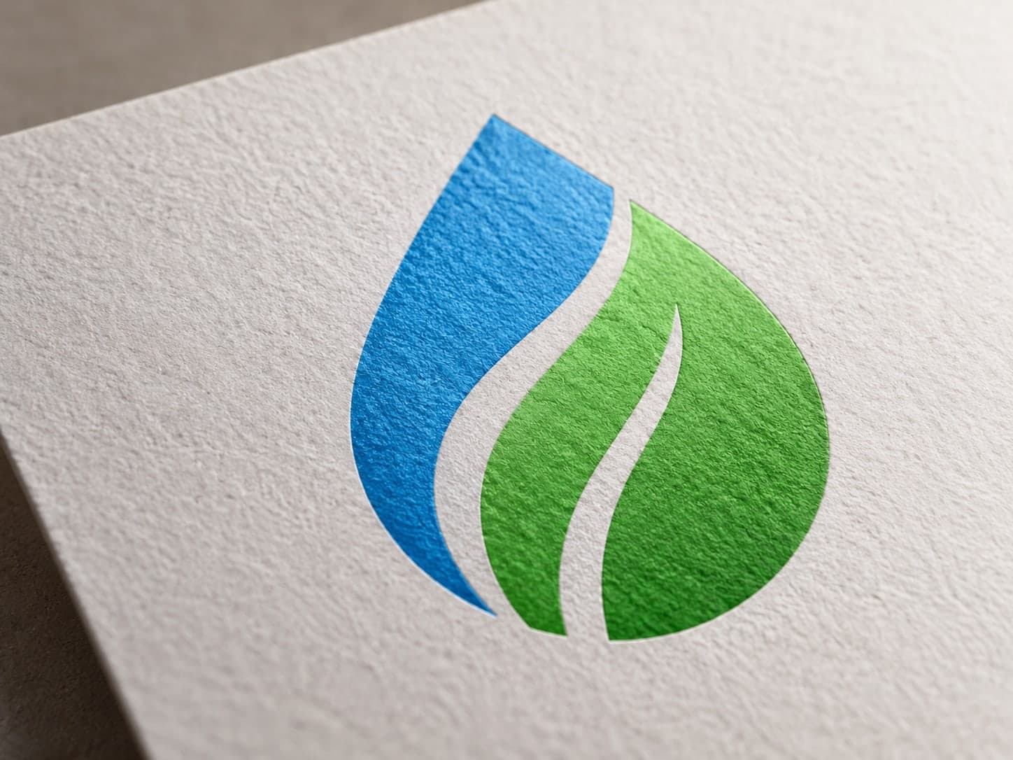
01 / Geometry behind the symbol
03 / Colour direction
Fresh.
Vivid. Recognisable.
Blue and green follow the droplet’s curves. On white, the mark has room to breathe; on dark backgrounds, it gains presence. Colour connects the symbol to its applications, from small details to the vehicle’s surfaces.
Small symbol.
Big presence.
The full logo introduces the name and service. The symbol can stand alone, while its curves expand into graphics for the vehicle. A system retaining its character across sizes and materials.
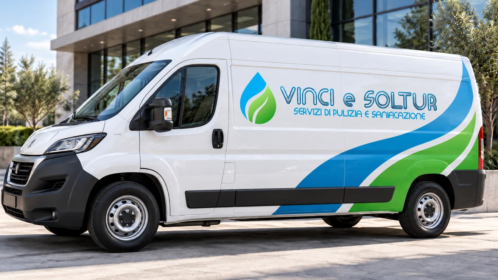
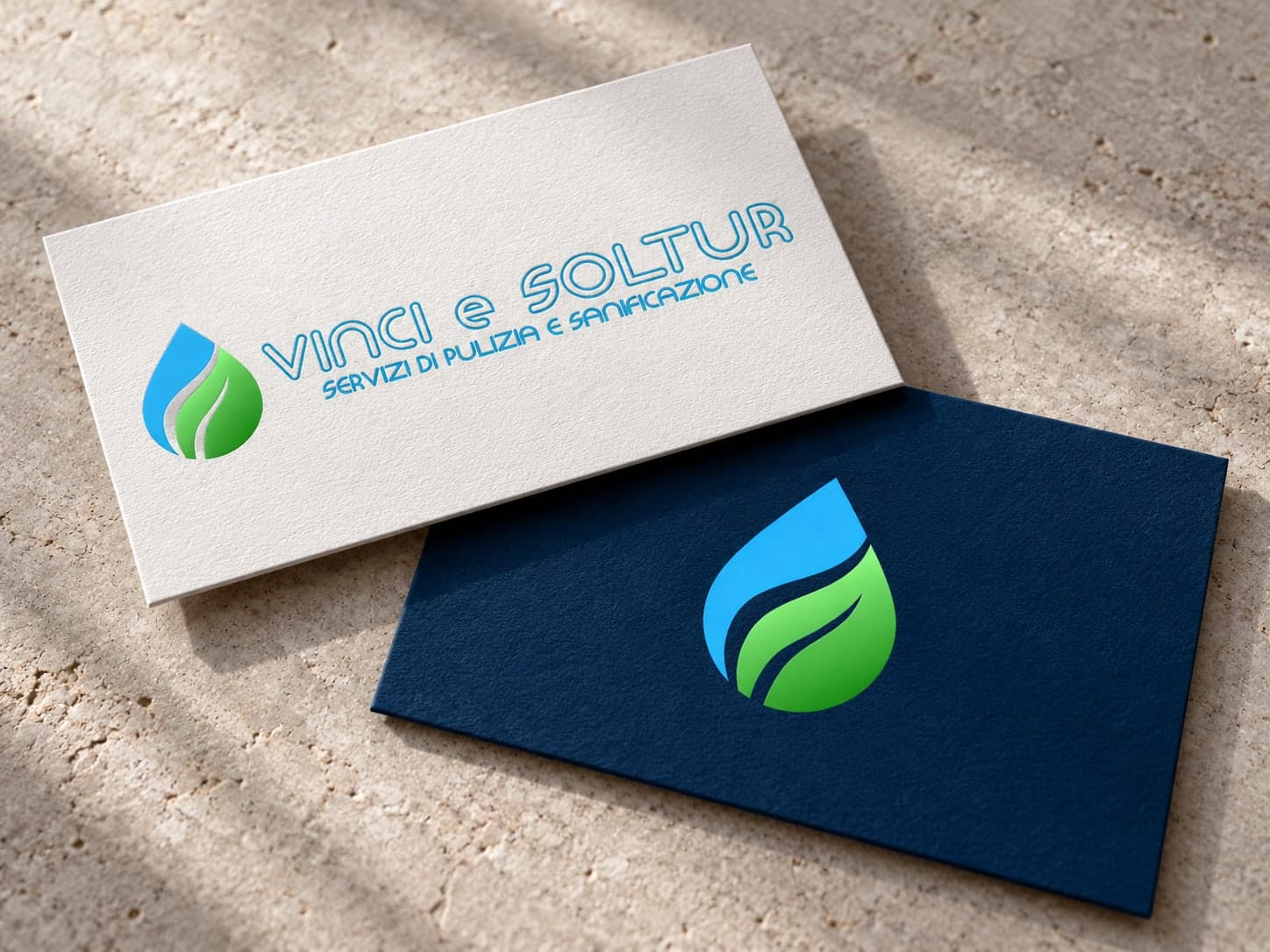
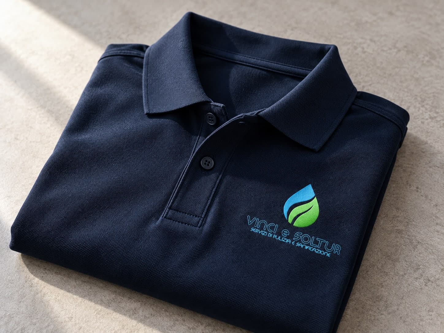
Visualisations of the identity applications.
Your next identity